It’s Not Personal, It’s Strictly Business.
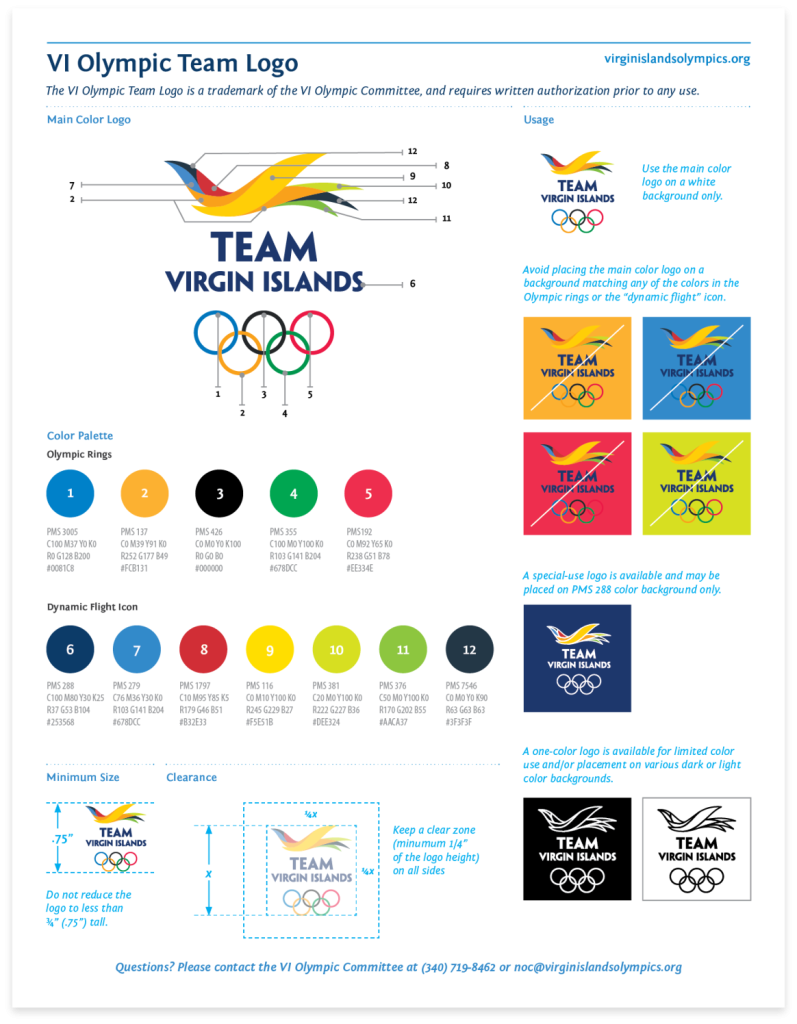
When designing a logo, companies often prioritize personal preferences over what is truly best for their business. There are several factors that play a role in defining your core identity. Here are some key considerations to start:

- Positioning: Determine whether your brand should blend in with others or differentiate itself.
- Style: Choose a design style that reflects your brand’s personality, such as classic, upscale, contemporary, modern, fun, etc.
- Shape: Decide whether your logo should include an icon or solely rely on typography.
- Color Story: Consider whether your logo should be colorful or have a simple color palette consisting of one or two colors.
We frequently receive requests from companies with a pre-established brand seeking assistance with a campaign. While we are enthusiastic about helping them, we occasionally face a dilemma when the overall branding presents challenges. Despite the client’s excitement about their new brand, we foresee potential risks. It is common for brands to overlook certain essential elements and lose sight of them. These core elements encompass:
- Balance: Assess how well the logo aligns with your overall brand image.
- Adaptability: Evaluate how effectively the logo can be used in different formats.
- Presence: Consider how the logo stands out when employed across various mediums.
- Readability: Ensure that the different elements of the logo are easily distinguishable, regardless of size.
- Marketability: Examine how well the logo appeals to your target audience.
Incorporating a logo into a campaign that lacks these critical components can make advertising a challenging endeavor, ultimately compromising the effectiveness of any campaign.
When this happens we are faced with what to do. Here is the story book outcome.
Once upon a time in a faraway branding land…
We decided to have an open and honest conversation with the company about the potential risks associated with their current branding. We emphasized that our goal was not to discourage them but to ensure the success of their campaign.
During the meeting, we presented our analysis, highlighting the areas where their logo fell short in terms of balance, adaptability, presence, readability, and marketability. We provide specific examples and explain the potential impact on their target audience and overall brand image.
To our delight, the client appreciated our honesty and recognized the validity of our concerns. They understood that a strong and effective logo was crucial for the success of their campaign. With our guidance, they agreed to reevaluate their logo and make the necessary improvements.
We collaborated closely with the client, providing expert advice and design recommendations. Through a series of brainstorming sessions and iterations, we developed a new logo that aligned perfectly with their brand identity and addressed all the core elements we had discussed.
The revised logo struck a balance between being unique and differentiating themselves from their competitors while also reflecting their brand’s personality and values. It featured a simple yet memorable icon that complemented the typography, ensuring readability even at small sizes.
The color story of the logo was carefully chosen to evoke the desired emotions and resonate with their target audience. It consisted of a sophisticated and modern color palette that enhanced the overall visual appeal.
With the new logo in place, the client launched their campaign confidently. The logo seamlessly integrated into all marketing materials, from print ads to digital platforms, with consistent and impactful presence. It garnered positive attention and resonated with their target audience, effectively conveying the brand’s message and values.
Over time, the company’s brand recognition and marketability grew, leading to increased customer engagement and business success. The redesigned logo became a symbol of their commitment to quality and innovation, setting them apart from their competitors.
In the end, the story of the logo was not just about its design but also about the collaborative effort between our agency and the client. By addressing the core elements and working together to create a strong and effective logo, we helped the company achieve their campaign goals and establish a solid foundation for their brand’s future growth.
The End
Well, not really. The brand endured for an extended period, until evolving styles and changing generations necessitated a refresh. However, this time, the changes were not significant.
Contact us to get started with your logo project today!

