Virgin Islands Olympic Team and Committee
Representing the dreams and hopes of US Virgin Islands athletes and standing proud in relation to other international Olympic logos.
The Brief
Taking advantage of new energy and a renewed commitment to the Olympic games on the heels of the 2012 Olympics in London, the VI Olympic Committee (VIOC) tapped MLB Creative to rebrand their Olympic organization.
The work
Logo Design
Brand Guidelines
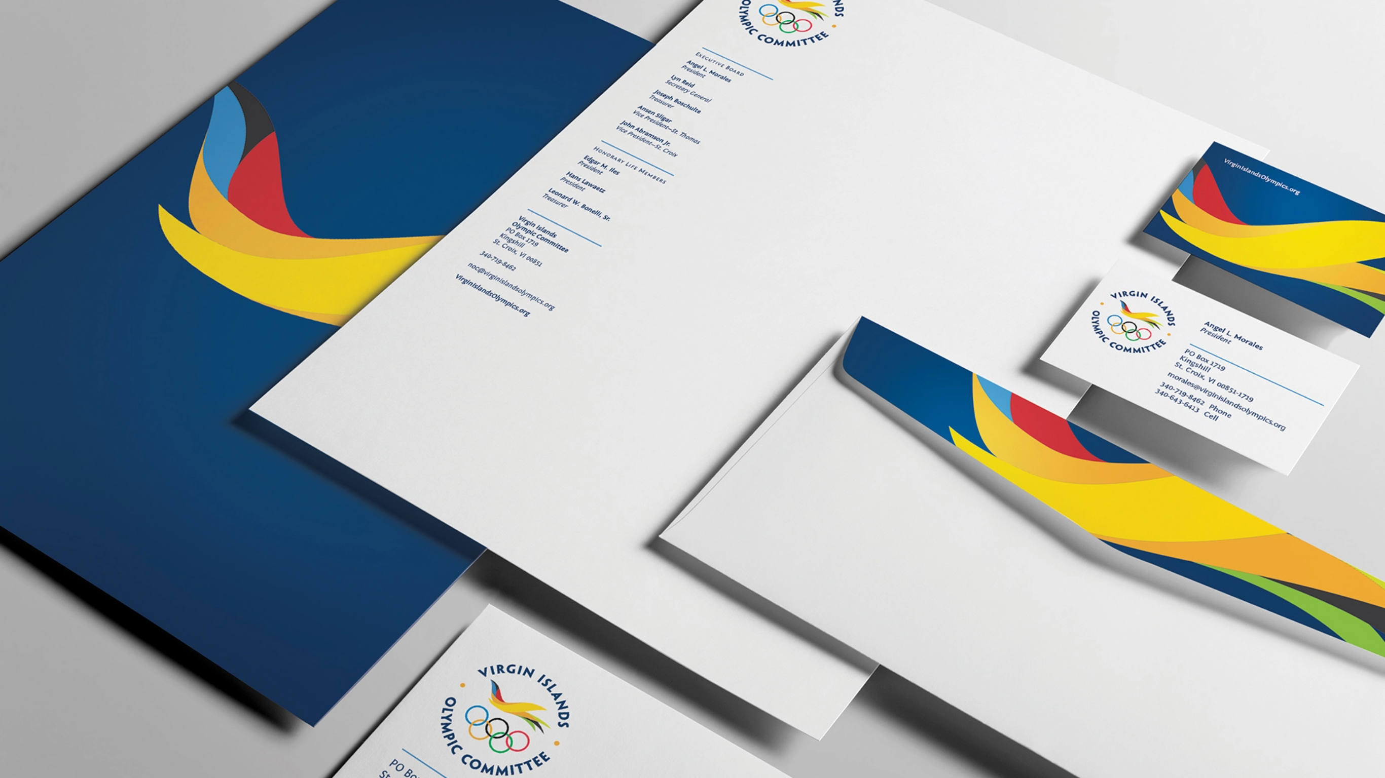
Collateral
Website Design and Development
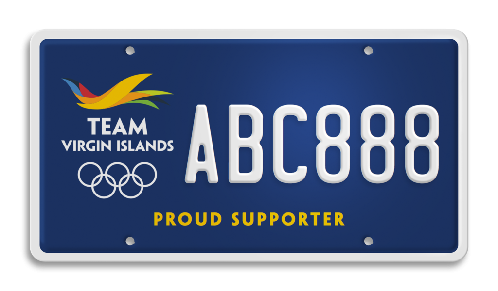
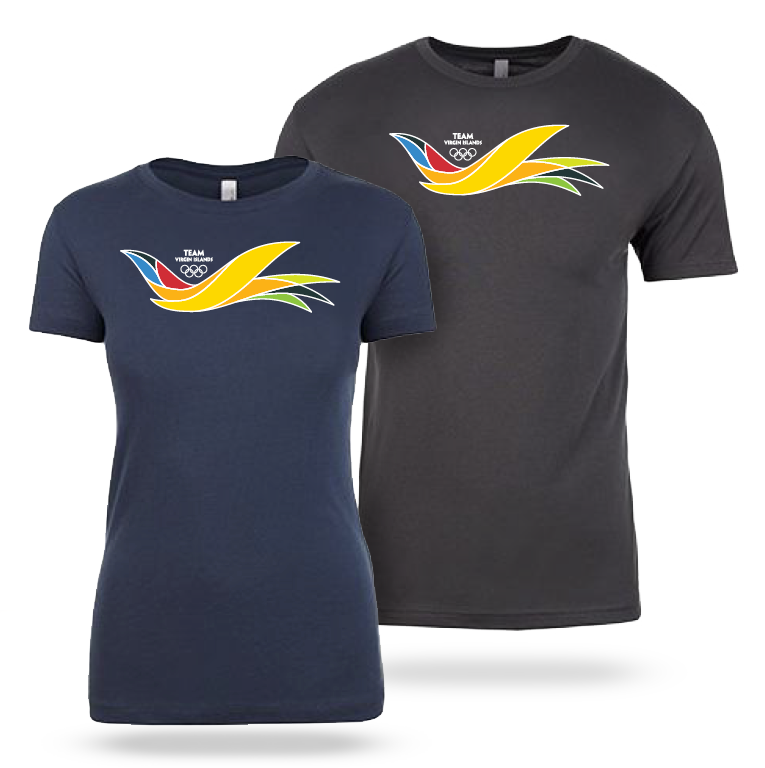
Swag and VI License Plate
THE LOGO
Two distinct conceptual directions were presented with in-depth rationale and sample branding applications to illustrate how the logo might perform on athletic gear, web graphics, signage and banners. “Dynamic Flight” was selected for continued development.
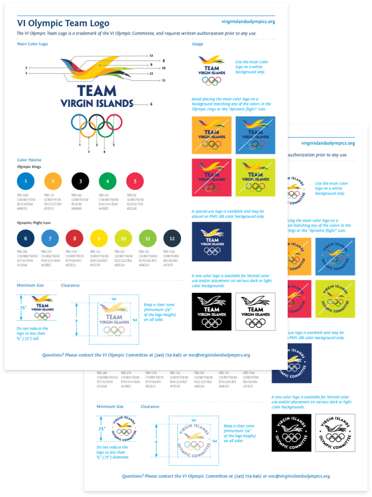
The asymmetrical dynamic shape conveys movement and flight in an upward direction to symbolize hope and aspiration. The highly stylized abstraction of a bird in flight also suggests waves, rolling hills with a vibrant color palette inspired by Caribbean flora and fauna. The full color spectrum affords more branding design possibilities.
VI Olympic Committee President, Angel “Chico” Morales described the new logo as “Inspirational, patriotic and symbolic of the hope of all Virgin Islands athletes pursuing the dream of participating in the Olympics.”
VI Olympic Committee President, Angel “Chico” Morales described the new logo as “Inspirational, patriotic and symbolic of the hope of all Virgin Islands athletes pursuing the dream of participating in the Olympics.”

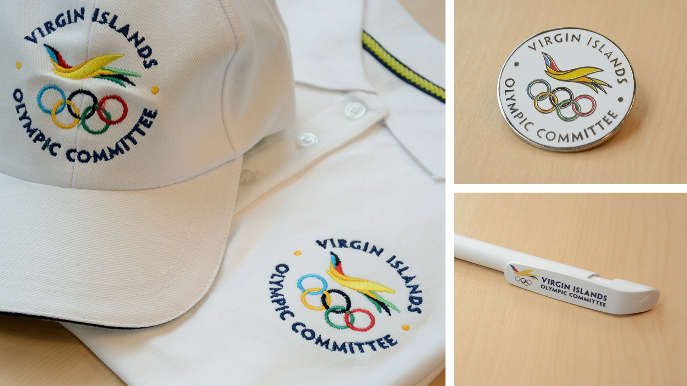
SWAG AND OUT OF HOME
After two years of development and approval by the International Olympic Committee in Switzerland, the logo was launched in a public ceremony at the Virgin Islands Government House in April on the 50th anniversary of the Virgin Islands Olympic movement and months prior to the 2016 Rio Summer Olympics. Collector pins, athlete uniforms, caps, shirts, an Olympic license plate and banners proudly showcased the new identity.