NTUA Solar Energy Campaign
A rallying call for unity and understanding at a time when misinformation is everywhere.
The Brief
The Navajo Tribal Utility Authority (NTUA) faced significant resistance to their utility-scale solar developments. They needed a campaign to gain community support and acceptance.
The work
Campaign Identity
Print Ads
Posters
Bill Pay Inserts
Radio
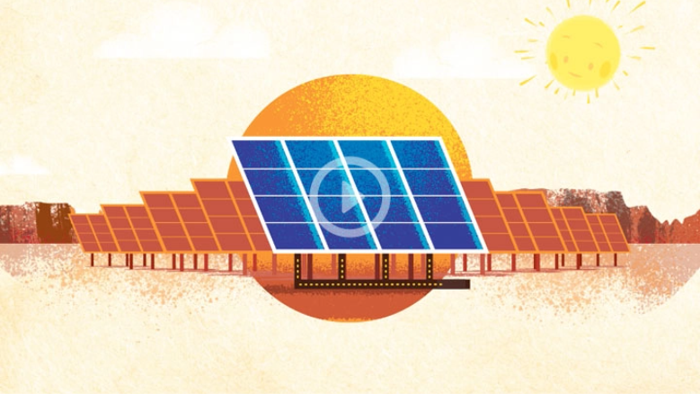
Educational Videos
Website Design and Development

THE CAMPAIGN IDENTITY
The number four is sacred to many in the Navajo Nation. There are four sacred mountains, four directions, four colors, four worlds, four sacred plants, and four times of day. With this in mind MLB designed a logo based on the four pillars that the campaign was designed to communicate— our people, our economy, our environment and our future.
The logo represents each of these four pillars and incorporates the shield of the NTUA logo as well as the sun graphic to convey unity and reinforce the messaging of “together we shine.”

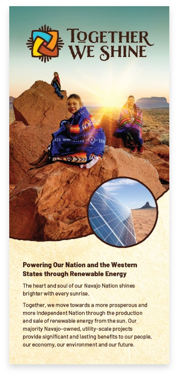
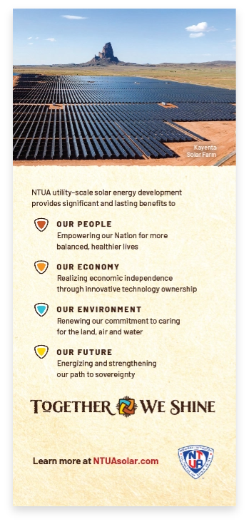
ADVERTISING
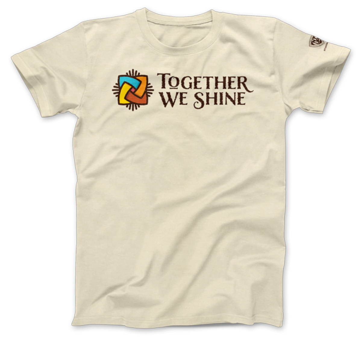
MLB used various communication methods such as t-shirts, bill inserts, posters, advertisements, and a locally produced radio spot to effectively communicate with the Navajo Nation community, which predominantly relies on print and radio as their primary sources of information.

ADVERTISING
MLB used various communication methods such as t-shirts, bill inserts, posters, advertisements, and a locally produced radio spot to effectively communicate with the Navajo Nation community, which predominantly relies on print and radio as their primary sources of information.
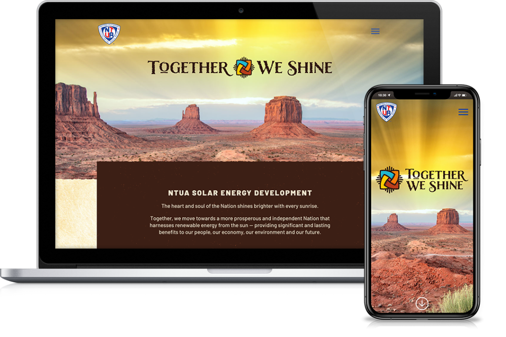
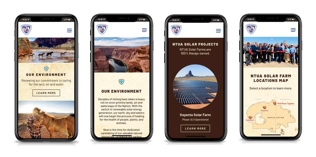
WEBSITE
We created a user-friendly mini-site to convey the campaign’s message and simplify the process of obtaining information without losing visitors in the vast NTUA utility site.